Tuesday 13 December 2011

Pastiche Shoot & Final Image


     I found this pastiche a lot harder than the first due to location, lighting and weather conditions. It took me quite a while to choose a location after visiting location such as Brighton, Tunbridge Wells and my hometown, East Grinstead I chose to take my image in Lewes. All of the locations had cobbled streets however I felt Lewes’ location related most closely to the original scene.  
     
     I felt the feeling of the location gave of this sense of modern vs. old just like Brassai’s ‘Paris after Dark’; the cobbled streets contrast with the street lights, lit windows and shop/restaurant signs.
     
      - I took the image using Ilford Delta 100 film with a Mamiya 7 so that the image wa in black and white, I used ISO 100 as this was what Brassai would have used as it was the only sensitivty available at the time.
      - I took the photo on a night after it had been raining a little so that the streets were slightly shiny like in the original image so that the streetlights would reflect off of the surface, and it was a clear night so the sky was dark. 
Brassai, 'Paris after Dark, No.27', 1933
    - I positioned the camera on the edge of the street facing up the narrow street that curved to the right but unfortunately this cannot be seen due to it having a slight incline.
      - Although not perfectly positioned in terms of height, shop windows in the background sit horizontal to the street lit up similar to windows lining the pathway either side of the street.
      - As I couldn’t find anywhere with neon signs, I used the street lights to illuminate the scene similarly which glow which meant I only had to use a very short exposure time.
      - Lights reflect off the pavement and cobbles in a similar way to Brassai’s photograph, as well as the sides of the buildings.
      - Although the shop sign on the left of the composition wasn’t white I have managed to include a couple of unlit shop signs  in the same position as in Brassai’s image.
      - I was also careful to position the camera so that the height of the buildings matched the originals; the buildings on the left give the idea of depth narrowing into the background while the first building on the right is tall followed by a lower lit construct followed by a taller building.  
      - Due to Christmas time there was a tree lit up in the background and compositionally this is not right however it does mirror the curve of the shop line light.
      - I used an aperture of around F.8/11 to give a medium depth of field similar to Brassai’s image as his image is mostly all in focus but isn’t perfectly in focus in the immediate foreground and background.
My Final Image (badly photographed)
      - My final print was quite complex, I exposed it at Grade 5 for 10 seconds, Grade 2 for 25 seconds while dodging the sign in the left foreground for 15  seconds. I then had to burn in the street for 7 seconds and the middle section of the street for a further 7 seconds as it was too brightly lit by the street lights.
      - The final result came out as I hoped it would, although it isn’t perfectly like Brassai’s photograph I am happy with the composition and lighting; I think the image gives off a similar atmosphere and feeling of a small cobbled street which would normally be filled with life during the daytime.      


Monday 12 December 2011

Brassai Research and Pastiche Analysis


Brassai, born Gyula Halász originally trained as an artist dabbling in drawing, painting and writing and his initial views were that photography could and would never be a fine art form. In World War II, Brassai fought against France and the Allie, and after wards joined a group of other Hungarian writers and artists at which point he worked as a journalist.      

In 1924 Brassai immigrated to Paris where he found his perfect surroundings to work as a writer, artist and journalist mainly in coffee houses. In the late 20s/early 30s however, Brassai finally turned his hand to photography; producing his first book ‘Paris by Night’. His work was a vision of how life was being lived at this time in France post World War II.

He used a variety of plate cameras with his first camera being a Boigtlander Bergheil and after that a Rolleiflex. Brassai produced static, motionless images using particular technical choices; he didn’t take endless shots of the same scene but to limit himself to one or two exposures, this makes his photographs look very deliberate and considered.

“There are many photographs which are full of life but which are confusing and difficult to remember. It is the force of an image which matters.”

Analysis of the image 'Paris After Dark, No. 27, 1933'

Image description:

- Brassai’s book ‘Paris after Dark’ was concerned with the lives lived within the city; this included the image ‘Paris after Dark, No. 27, 1933’ Which I am creating a pastiche of as part of ‘The City’ unit.
- The photograph depicts a dark, cobbled street lined with ‘Hotel’ neon signs which reflect off the smooth cobbles. A lone figure can be seen disappearing into the blackness in the background having emerged possibly from one of the dark doorways lining the street. The bright sign lights and illuminated windows gives this sense of life within a small windy backstreet; it’s a different way of viewing these places which during the day would probably be filled with people going about their business.  
- The image has quite an atmospheric feel especially with the dark, shady figure in the background. The buildings tower over the camera from all sides creating quite an imposing scene especially with the building in the background boxing the image in not allowing the audience to see into the horizon which makes the location very anonymous.

Visual choices- focus, distance, lighting, camera position etc.

- The Depth of field in the image is quite average, although I would say most of the image is in focus I wouldn’t say it has a really high F. stop. This is because if the F stop was high then the exposure time would be increased and therefore the figure in the background would be a lot more blurred than it is.
- However looking more closely at the image the exposure time would probably not have to be very long as the vast amount of lights filling the street would have been enough to reduce the exposure to possibly seconds.
- Due to the time period it is obvious that the ISO would have been low, the image is quite dark with lots of black and grey but not a lot of white apart from the bright white lights.   
- The weather conditions are quite calm and clear from what can be seen of the sky; due to the shine of the cobbles however there could have possibly been rain earlier in the day.
- The camera is positioned on the edge of the pathway angled slightly into the narrow road looking down the curved street. The camera is angled looking a little towards the sky showing the vastness of the buildings lining the street.

Process & techniques

- The image is a black and white analogue silver print printed in 1933.

Social & cultural background

- ‘Paris after Dark’ was Brassai’s first set of images within his photographic career which he began after emigrating from Hungary in the mid-1920s.  
- He was a writer, journalist and artist which inspired his photography later which are all quite artistic in composition and lighting.
- It is possible that Brassai’s work was influenced by the great depression affecting France from about 1931 through the following decade. His images taken at night when the streets are empty could be a metaphor for the lack of money and trade in France; however it could also be highlighting the robustness of France during this period due to the continuing trade shown through the lit up Hotel signs.

My feeling & reaction

- When I look at the image a feel a slight sense of seediness as although the street is lined with Hotel signs so is therefore a busy street it also looks like a backstreet especially with the shady figure loitering in the background disappearing into the night.
- The bright lights encased by the window frames at the end of the street make me very inquisitive and wonder what the building is; whether in actual fact the photograph is taken during Winter (possible due to the coat worn by the figure) and the image is actually not taken that late at night and therefore they are houses.
- I can also imagine a roaring trade behind the hotel doors, the bright lights give this sense of optimism, modernism and forward-thinking in contrast with the old, narrow cobbled street they line. 

- I have used this analysis of the image to create a pastiche which I think mirrors these sort of ideologies I feel Brassai may have had, I also thought very carefully about the composition of the image, the time of day, weather conditions and camera settings.   
- I will make a blog post about my pastiche shoot and the final image print shortly.  

Wednesday 7 December 2011

The Body Unit: Final Ideas, Research and Shoot Plan


Reading a book called 'What is a Child? Popular Images of Childhoos' by Patricia Holland which analyses how children have been portrayed in the media drew my attention to the idea that girls grow up with a totally different perception of the world.
 Girls grow up having to learn how to present themselves obviously more exaggerated before the 20th century where females were expected to wear floor length dresses and behave respectfully; however girls are still more aware of being watched rather than watching others. It is a sort of exhibitionism where they observe adult behaviour and reproduce the qualities they see and think is expected of them; by deliberately putting themselves on dispaly like this they have already lost their innocence in this way. 
Whereas I felt when reading the book as well as in everyday life boys have a lot less expected of them in terms of behaviour especially at an early age as it has been found that the male gender mature a lot slower than females. Therefore I decided to use male models as they are often less self-conscious and less posey, so will have produce more naturally occurring scenes in my work.

The child's obliviousness to the camera would create the most natural image and in turn a much more innocent result. My first concept that I wish to capture in my shoot is an image where the child is distracted inspired by Bettina von Zwohl's work where she hangs a toy out of frame to distract the attention of the one year old. 
  To create this I may use the mother with a toy stood to the side of the shot or have the toy in the frame of the image so that the child is playing with it like a cuddly toy. As I have two models it would be interesting to do some individual shots where they play on their own and other when they're are interacting with one another to see what sort of image this gives me. 
Learning is a part of life which comes in many forms- socialising, playing but nowadays this has taken the form of technology such as telelvision programmes and Nintendo DSs; I feel that this distracts the child from the real world and limits some areas of leanring. I have asked the mother to bring something similar to this and she is bring a Leapfrog game, again on the one hand the child playing with it will be acting naturally to the game but at the same time have an unnatural feel as the child is unsociable and in a way we now expect children to pose in front of the camera lens due to familiarity to technology. 
This was discussed through a series of images made by Wendy McMurdo called 'Dark Matter: Digitial Play 2007' which depicts children emersed statically in their DS while surrounded by a location normally associated with activity.
They are very uncomfortable to look at as they are showing the reality of childhood these days, emersion into a screen and anti-socialness which I think stops creativity and for me being an art & design student when I see an advert for a DS game where you can colour in drawings on a computer screen and this is called creativity I am disgusted by what a child's creativity has been boiled down to; which begs the question what is innocence nowadays really?


Even without a computer screen young children are often seen staring into the distance emerged in their own little world or just simply playing by themselves; when looking at Vee Speers although so are slightly twisted the costumes are an expansion of the child's imagination. 
So in a way I feel that these children are portraying more innocent acts than those in Wendy McMurdo's images as they are simply acting out and dressing up as a character they have dreamt up rather than characters of a story being forced on them like in many DS games.
And interestingly even though Speers images sometimes contains dead animals, I find Loretta Lux's images less innocent, they are very posed and the children dressed by Lux are almost perfect doll-like figures frozen in time.
The setup seems a lot more contrived as if trying to portray a perfect world rather than a child's imagination unlike Speers work.
I want to try and have some much more posed images like Speers and Lux's where the child is still, looking either into the camera or in to the distance much like von Zwohl's work but in a much more setup scene.

Although I interpret Speers images as a portrayal of childplay the overall feel of the images are quite eerie touching on this idea of tainted childhoods due to the media, technology, society etc. Being exposed to things affects our behaviour whether it be a camera put in front of us or a more disturbing occurrence such as witnessing violence or being exposed to sexualised behaviour. I watched a programme which drew my attention more to this called 'The Sex Education Show: Stop Pimping our Kids' where they highlighted the way that the most recent generations of children are growing up too fast due to watching sexual behaviour in music videos, wearing inappropriate clothing and observing men's lifestyle magazines.
Speers seems to highlight some of these factors in her work, where children hold guns and dead animals which we wouldn't normally want to expose children to tainting the idea of innocence. 

The flat lighting combined with the dead pan backdrop with cracks in is also intriguing as white is usually associated with innocence which gives this feeling to the image but is almost to flat giving a peculiar unease to the scene. 
I want to create a similar background for all of my images but with a different message linked to it; I will use creased fabric to mirror this idea of children plaing in their bedroom building imaginary locations eg. castles and tents which reverts back to this feeling of innocence. I will use flat lighting to make sure the backdrop & child's complexion is quite pale to make it very soft and not high in contrast. 
In the posed images I want the boys to look straight into the eyes of the audience to create a feel of innocence like in charity adverts; children of third world countries are filmed looking down the camera at the audience sat at home which tries to persuade them to donate.
This is innocence where the child would not be very aware of what it is they are looking at but at the same time they sort of aren't portraying true innocence due to a foreign object being shoved in their face.

I also looked a little at Ingar Krauss' Juvenile prisoner series where she uniformly photographed children in the prision against a blank wall. This children due to the fact that they had committed a crime are no longer seen as innocent therefore I wanted to think about what it was that makes the children look different to Speers' children.
The bricks gives this sense of hardness, a barrier stopping the inmates from escaping and therefore conflict with our idea of a child's persona. The uniform of the children without knowing the reason for them wearing it is very bland and doesn't remind me of what a child should look like. The expected clothing of a child would be pastel tones which is why I will have my models in light clothing.
The camera position is below the figures eyeline which I find intriguing as it gives this sense of the child overpowering the adult audience members making them look quite powerful. Therefore I will position my camera ever so slightly above the child so as not to intimidate the subject but to show them as how they should be. 
Again I will use soft lighting and the children's own light coloured clothing to keep it natural rather than looking like Lux's almost small adult looking children where she dresses them in shirts and suits.

      So to recap my two models are boys aged 4 & 7, I will have them dressed in light clothing, with several different concepts- some posed and some natural. I have asked the models' mother to birng some of their favourite toys both soft and cuddly like teddies and technological like Leapfrog to capture different emotions and expressions produced by the children. 
      I will bring in two small chairs to give a well-proportioned image rather than adult chairs so it gives a more childish atmosphere combined with the crumpled white sheets. 
      I will create my lighting using soft boxes to create extremely soft shadows and no harsh bright light on the surface of the child’s skin (as shown in the diagram below)

It is interesting how when we think of child toys we see cuddly toys like teddies etc. as a symbol of childhood innocence whereas technology is associated with adulthood eg. Mobile phones etc., the teddy bear is like the modern day lamb that represented Jesus. So it will be interesting to look at the way an audience views a child with a cuddly toy compared to a technological toy like a leapfrog. Doing research into child toys I have found that even Leapfrog games are being turned into a sort of advertisement for products which children seem to be acquiring earlier and earlier in life; for example they now produce LeapPad with apps which will lead on to iPads and phones etc. This makes me curious as to whether children are being exposed to technology too young and therefore making them lose their innocence at a much earlier age.
I don't think I will ever quite figure out what innocents is as it has been interpretted in so many different ways through history and art forms; but in my final image of the Body unit I want to portray my personal view on innocence or possibly the loss of it.

Wednesday 30 November 2011

Environment Unit Test Shots

Over the last couple of weekends I have travelled to several different locations during the early morning to capture some test shots of car parks in their vacant state. Like I had mentioned in my previous blog entry on the environment unit I started to think about weather conditions more.
I have selected a few of my favourite images from each shoot that I scanned in to the computer and some of which I plan to print and consider as final images.
The first set are from my shoot in Bluewater car park, the history of this shopping centre developed my initial ideas. The complex is situated on a 240 acre plot of land which was previously a chalk quarry which supplied to builders in London; I find the idea of an emptied area of land being transformed into another form of empty land very intriguing and quite humorous.
I like the first image due to the repetitiveness of the space lines, the trees and the lamp posts disappearing into the distance as this creates a sense of vast space as well as uniformity. The weather conditions early in the morning are slightly foggy giving a sense of vastness and mystery; the faintness of the tones has a flattening effect on the image. In the second image the backdrop enhances the magnitude of the location, I like the way the different lines of the elements in the car park cut through the frame and sweep across the image. The image has lots of different levels, starting with the unnaturally artificial lines cut into the chalk cliff, then the softness of the trees and bushes and finally the geometrical shapes and lines on the concrete surface.       


Although I don't think this third image fits in with my theme particularly well in showing emptiness I just wanted to put it in my blog entry as I particularly like the geometrical architecture in front of the natural flat cliff face. I was also drawn to the way the developers tried to contrast the aggressive, ugly concrete with a small garden in the centre of the frame.  

I find these final three images my favourite from the Bluewater shoot, while walking through the car parks I was straight away drawn to the tyre tracks. I feel they are like a ghostly reminder of what had previously been there & for some reason I really like the last one with the abandoned truck sat amidst the vacant car spaces. This is when I first started becoming attracted to reflections; I find these reflective surfaces reminiscent of Rut Blees Luxemburg's night images. I found with her images the puddles were like portals or holes into a ground below the concrete so I guess this is my attraction to the reflective tracks. Like they are gaps in the concrete as if there is something not quite right with the scene; linked to the history of Bluewater- a huge void created in the planet filled with industry. 

These next set of images were taken very early in the morning in the IKEA car park; I was drawn to the extremely foggy conditions and was quite excited to find out the outcome of the shots. Again like the previous Bluewater images, the surface of the car park was very reflective and the mistiness added a sense of mystery to the images as to what was beyond the edge of vision. 


 I particularly like the blue tones in these images, due to the weather conditions there is very little extreme darks and lights which gives a flat feel in conflict with the fact that the images are so dense you cannot see the horizon. These images reminded me a little of Hiroshi Sugimoto's landscapes such as 'Ligurian Sea, Saviore' where it is indecipherable as to what is sky and what is groun or sea in Sugimoto's case. 


I finally visited a nearby industrial estate car parkwhich was even foggier, I myself when in the fog walking and driving around felt quite on edge almost scared. I think I have a slight phobia of things coming unexpectedly out of nowhere; which I found especially with the IKEA chimneys because they are normally a landmark so you know which direction IKEA is but weirdly there was no sign of them when heading there and suddenly they emerged out of nowhere which for some reason freaked me out. Hard to explain but I hope that makes sense because I feel that's where my weird attraction to fog comes from combined with reflections.
Even though these last images express similar themes to my previous shoots I am not so pleased with them, the tones are very cold unlike the Bluewater and IKEA images which both have similar blue shades. I also don't find the images particularly exploratory or as original as my other shots. 
I am planning on printing a couple of these images to discover whether they have the right outcome and impression I want, as well as looking at how well they work together.  

Tuesday 29 November 2011

Life Drawing

This blog entry is rather late but I thought I better put up my efforts at the life drawing sessions we had a couple of weeks ago. During my Alevels I had done a series of life drawing lessons with a few different models and I really enjoyed being able to explore the way the body moves and sits. 
We began by doing five very quick drawings with ink applied with sticks and water to add small areas of shadow. I like the sketchy look of the figures even though they aren't very good I always looked forward to using this technique at Alevel. 
The second image is a 5 minute sketch using charcoal, it is quite a simple drawing with a few areas of shadow done by smudging the charcoal; I liked being challenged to make the model look as if he was really sat on a stall which I think I succeeded at. I then thought a little about the lighting, the spotlight was in front of him and the shadow reflects this being mainly round the side of the body and on the backdrop as if he is sat up against a wall. 
We finally did a 20 minute drawing where the model again was stood so I could explore how stance effects the way the weight sits. I am particularly proud of the proportions and shading in this sketch, the way the shadow of the arm sits on the back of the body. I also liked the shadow falling away from the figure along the floor; the life drawing teacher asked us to black out the whole of the background however as the lessons were to help us consider lighting for our body unit shoot I decided to shade it in this way.
Overall I found the lessons really helpful in considering the lighting for my shoot, however after looking more closely at the effects of harsh lighting on the body I have decided to create very soft lighting on my model probably using soft boxes on more than one light source.   

Monday 28 November 2011

Deconstructing Photographers: Luxemburg, Wentworth & Lutter

When looking firstly at all three of these photographer’s work I have found they all investigate and explore urban spaces in cities from different perspective and using unique technical approaches. The individual’s work portrays scenes that we pass by every day and ignore.
Rut Blees Luxemburg, Richard Wentworth and Vera Lutter look at the mundane and by finding new ways to view these places make something normally boring quite beautiful and interesting for an audience.

Firstly the photographer, Rut Blees Luxemburg is well known for her employment of long exposures to take advantage of the light emanating from the signs and lights that frequent city streets, as well as building windows towering above the urban space.
Luxemburg works mainly after dark as she believes that the city reveals itself more to her when it is no longer part of the daily bustle of shoppers and workers; she likes how aspects of the city that are normally not observed during the day are amplified at night like shadows. Rut Blees Luxemburg wants her work to express a sense of presence not to show it as a threatening place.
To find her locations she simply wanders the streets and therefore none of her shots are ever set up but merely observed and documented. She believes, ‘Walking has this effect on the wanderer of creating a rhythm and within that rhythmic walking your mind,.. becomes more free, and in that special heightened awareness you then are able to notice places.’
The colouring in this following image was very eye-catching for me, almost glowing and radiating an artificial light imprinting the sign post shadow into the wall creating quite a flat looking image. The fact that the sign post is projected on to a very blank wall gives a sense of confusion as if someone is lost within their mind. The very tight framing is very mysterious making the audience wonder where the signs are pointing you towards and where you are in general as the wall seems to have a blocked up window hinting at absence within the area.
Time Now, Location Here, 2010
Luxemburg often makes work based on the inspiration of poet Friedrich Holderlin’s poems from the German Romantic period; she often focusses on one line and forms her theme and final image around it.
A series of work titled ‘Piccadilly’s Peccadilloes’ consists of images taken of Heathrow Airport (Terminal 4) Tube station ticket hall, commissioned to celebrate the 100th year anniversary of the Piccadilly Line.


Luxemburg’s images in this series were mainly of reflections in the pavements of the architectural designs, this was quite a different way of looking at buildings. It is almost a metaphor for the tube, the way that you are looking at the underground related building as if it’s under ground viewed through a hole. It explores the idea of vertigo in the way that something that is usually towering above is now being submerged below the audience, bending your sense of perspective. Also by featuring the puddle, Luxemburg could be commenting on the idea of fleeting time within an urban space. While the building sits watching over city life, people are always rushing around moving forward in time and the puddle will soon be gone destroying this unique viewpoint, completely changing the view of this space.

Rut Blees Luxemburg’s image ‘Enges Bretterhaus / Narrow Stage’ 1998 is very interesting for me with the use of colour particularly.


A red container sits abandoned in a car park with a chair and table set up inside and as there is a drink carton you feel as if it has recently been frequented. The emptiness of this confined space has a sense of absence making the audience wonder who is usually sat there and why?
For my city project I have been very intrigued in the car park location and its effect on the surrounding areas therefore I found this image interesting to analyse and decipher. The way that a car park is usually a temporary housing area for a person’s car however here it is obvious that this object is quite permanent, a seating area in a car park, and therefore out of place reflected by the colouring.
The vibrant tones are out of place and is therefore very conflicting with the surrounding colour scheme often seen in Luxemburg’s work which she also draws upon when photographing neon signs which again are artificial.    
The open door feels oddly inviting as if you would be walking into someone’s personal space, again by photographing at night time the interior is in shadow contrasting with the exaggerated street lights outside. This enhances a claustrophobic feel within the space while outside sits a vast open car park, which again is what I am exploring in my own work- huge empty spaces consisting ironically or small (car) spaces amongst the busy urban expanse.    

Richard Wentworth’s main body of work explores mundane scenarios through sculpture, and therefore he uses photography to document everyday sculptures seen on the street in cities either set up or spontaneously discovered; I was particularly attracted to his on-going series of images, ‘Making do and Getting by’. Much like Luxemburg, Wentworth changes people’s perspective not on scenes but rather everyday objects.

The title itself hints at this idea of ordinary situations being captured as an art form like a piece of paper jammed in a parking meter to reserve a parking space. These scenes are momentary, never to be seen again, snapshot like; however others are more set up, recreated by Wentworth at a later stage as if they were caught absolutely by chance. It makes something that is usually quite unattractive like litter stuffed between the wall and a pole ignored by passer-bys very beautiful and eye-catching. 


The images are very close-up only focussing on the thing that Wentworth wants the audience to look at with quite a shallow depth of field, looking at how the everyday person interacts and treats the space around them. His colour palette is often very muted again reflecting the dull colour scheme in urban spaces consisting predominantly of different tones of grey and brown. His images are very obviously snapshots on the streets due to the overcast weather conditions seen in most of his images where the sky is visible; however in general his images are not overly lit which highlights muted weather conditions. 


He portrays the city as a place for littering however Wentworth looks at how people seem to disguise this habit by placing their litter on a surface or wedging it between something therefore by not chucking it on the floor they haven’t littered and aren’t ruining the environment in which they live in. In a way Luxemburg and Wentworth do similar things in their images looking at how one thing can be used as something else eg. Luxemburg uses puddles as a portal to home in on and view aspects of the city; while Wentworth looks at how humankind uses something such as a shelf as a storage area or a book as a wedge to prop something up.

Vera Lutter uses the most basic photographic device, the camera obscura to create large images of architecture in urban spaces; it was originally developed during the Renaissance to capture the surrounding world through drawing and painting as we discovered when watching ‘Omnibus: David Hockney’s Secret Knowledge’ during a workshop. 


She produces black and white photographs of cityscapes captured by transforming a room into a pinhole camera obscura, exposed for long periods of time like Luxemburg’s images taking advantage of the light however Lutter’s images take advantage of the natural light. They appear as solarized images with very little tonal range which gives the city quite a melancholic feel similar to the view that the other two photographers have on the way we treat our city space. 

The locations photographed are highly populated however due to the long exposures the people are not visible and therefore creates a post-apocalyptic scene of emptiness; all three photographers photograph urban space as a vacant location which is completely opposite to reality.
She looks at constant movement of our society through a photograph of an aeroplane however due to the long exposure part way through the plane has lifted off leaving the space vacant; I really like this ghostly effect which creates a double exposure feel to the single image.

The camera obscura is usually set looking down over a large expanse to expose the scape in cities as well as possibly commenting on pollution. This is because Lutter has chosen to leave her image in negative form therefore the building windows shine brightly against the dark buildings giving a sense of wasted energy much like a heat sensor image would appear.

All photographers look at our ignorant view on the world; they are all, even though totally differently composed trying to make us look at the little things in the frame, the sign reflected in the puddle, the note wedged in a parking meter, the tiny windows lining the skyscrapers; again highlighting our throwaway society whether its rubbish or energy. It is interesting how they all focus on scenes where no human presence occurs despite their work commenting on humans’ actions, showing how we have come and changed the world and could possibly leave it.
Light is an important element most definitely in Luxemburg and Lutter’s work both only being able to produce images by exposing their photographic material to light sources for long periods of time; whereas Wentworth’s lighting is very different however it reflects his message of melancholy over the situation much like the other two photographer’s work.

By being given this task of exploring different photographers work it has helped me to open my eyes up more and further my own unit of work on the city, thinking even more about lighting and how composition changes the atmosphere of the image. I have been particularly attracted to Rut Blees Luxemburg’s compositions of images set in car parks as I am already exploring this vacant urban space so I hope to explore her work a little more.

Tuesday 22 November 2011

Environment 'Urban Space' Unit: Initial Research

My first ideas were subconsciously influenced by the series 'A Machine for Living' (1999) by Dan Holdsworth whose work I rediscovered after taking a few test shots over the weekend. 

Holdsworth uses a long exposure to capture Bluewater, a large shopping centre and its surrounding car parks set in a huge disused quarry.
Before looking at Holdsworth's work I had researched the history of Bluewater's location, mirrored in my emerging unit theme I am really intrigued by the way we use and re-use space. After the quarry had been abandoned a question was asked, what to use the space for, so a shopping centre was built. Although the shopping centre is massive it is the surrounding car parks which took my attention; built to home cars during the day but what happens at night, the space is once again empty, deserted. 
I find it quite ironic and a weird concept how we are running out of space to build housing to live but then we fill an empty space with thousands of more spaces which are empty, temporary homes for transportation.
I like how Holdsworth creates an eerie atmosphere through long exposures using the artificial lighting which gives his images an unnatural colour and the way that scale is hard to discern due to the absence of human life.  

Again I have looked a little into the work of William Eggleston, at his mundane everyday scenes often taken in run down towns. The car parks photographed are therefore usually empty which gives a sense of isolation and disconnection. 

Although Holdsworth doesn't want his images to be associated with the location rather just a  place, Eggleston's location are unidentifiable as they are usually tightly framed and of no significants like a shopping centre. 
The way he shoots the emptiness gives you this strange sense of abandonment, that no one has been there for a while, like he may have just discovered this place after 10 years. 
The second image of his is very eye-catching for me as the weather seems to reflect the sort of emotion you should feel when viewing it a sense of loss and emptiness. 

 I find the dull, neutral colour palette of Eggleston similar to that of Stephen Shore's images; in both photographer's work I also find that often the only measurable object is a lone lamp post creating a sense of isolation. 

His series 'Uncommon Places' also focusses solely on the everyday scenes that we see everyday. I feel like the above to images could be compared to one another in the sense that one portrays a tired, empty town while the other depicts a busy town showing how a similar amount of space can look so different.
I am particularly drawn to the early morning tones of the first image with a slight fog encompassing the three cars in the shot which sit abandoned and isolated.

While reseraching 'urban space' I came across the photographer, Branislav Kropilak whose work mainly focusses & investigates the intimate relationship between humankind and technology. His work revolves around industrial design, architecture and urbanisation, looking a lot at gemoetry and pattern.


His series 'Garages' looks at this idea that we build structures on land which are then unoccupied for half of the time; I really like how different spaces like this look when empty compared to when full. 
The vacant space is beautifully composed each time in this series which creates a slightly haunting atmosphere, which reflects the idea of the effects that we as humankind are having on the environment constantly growing and urbanising more of the land.
The artificial lighting in these images is obviously perfect for the purpose and reason he had for shooting them however I dislike the garish lighting and prefer natural sunlightreflecting off the flat, man-made surfaces. 

James West, a British photographer based in Leeds, West Yorkshire, photographs a lot of his surrounding area almost documenting his environment in which he lives in. He often works in all manners of places from fields to car parks to royal halls; the images below are from his series 'Empty urban spaces'. 


These urban spaces depicted in his images begin to create the feeling of dereliction and abandonement of a run down town. The top image shows a car parks lined by greenery showing how empty rural space was urbanised and turned into a car park which is now empty and recaptured by nature.
I like the lighting in both of the images, the first due to the reflecting nature of the moody, overcast weather and the vacant scene; while the second image is very misty highlighted by artificial lights. I like how you feel as if something is being hidden within and beyond the fog unexplored, this also scares me in a way not sure why. 

I discovered the architectural and landscape photographer, Kim Høltermand, who by day is a fingerprints expert in the Crime Scene Unit of the Danish National Police. I feel like his career can be seen reflected through his meticulous shooting style with the perfectly mirrored scene. 

'The Deserted City' series was shot around Copenhagen on an early Sunday morning, with weather conditions being very foggy; the fog combined with the vacancy creates this image of an eerie apocalyptic feel as if everyone has just disappeared. The neutral colour palette is quite peaceful and still, while the white parallel lines jut out disappearing into the distance which enhances a feeling of empty urban space.

In Bryan Schutmaat's work he depicts the American West as this populated, urbanised space but at the same time creating this sense of abandonement as if we have explored and moved on. Again his work is quite documenarial it the way that he frames the shots to highlight the occupation of space. 


Like Eggleston and shore, Schutmaat captures the everyday scenes, I feel the weather looks quite optimistic in contrast with the scenery of what look like abadoned buildings almost a nostalgic image to evoke people's memories of the places. 
The colour palette is quite bland but in a sense it perfectly mirrors the mundane scene portrayed in the frame.  Both of the above images are similarly composed with vacant car parks leading up to an unoccupied building with half the frame filled with blue cloudy skies. 

After reseraching a few photographers work I am really interested in looking more in to the effect that weather conditions can have on the atmosphere of the image. I will possibly revisit some of the locations I went to on the weekend including the IKEA car park (however maybe not Bluewater again as I got told off for not having a permit to take photos of a car park!). 
I may also look a little into other locations which are usually vacant, only used as an 'urban space' part of the time such as fields used for fun fairs. I am intrigued by the way a space is transformed by occupancy. 

The Body unit: Initial Research

My initial influence of the body unit is the photographer Loretta Lux whose work I first discovered on a postcard titled 'Ophelia, 2005' in the National Portrait Gallery; and after looking further into her other works have fallen in love with her work and techniques. 

Ophelia, 2005
Many of her images are quite surreal due to the unusual and unique artistic methods Lux uses to edit her images often hand painting the prints to give the subjects smooth, porcelain-like complexions. It gives a neutral cupid like skin tone which could have been inspired by paintings by artists such as William Bouguereau where child-like figures are portrayed as innocent, fragile figures.
'Cupid and Psyche as Children, 1890'
Her work looks at underlying themes of changing levels of innocence and the loss of it through adolescence; however I want to focus more closely on the more neutrally toned and plainly composed images of young children.


I really like the blank canvas lookof the backdrops in many of Lortetta Lux's images enhancing this sense of purity; although the perfectly composed children staring into the camera lens gives a slightly eerie edge to many of the portraits. Playing on the idea of when a person is innocent, when it is lost and what it is.

'Isabel'
 The neutral, pastel tones of the colour palette also highlight what society sees as innocent but it still gives a stark feel to the photographs therefore leaves the audience slightly uneasy about the subject matter.

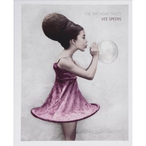
During my Body tutorial I was introduced to the photographer Vee Speers whose work 'The Birthday Party' has also fascinated me in the way that she has composed and lit the figures.
'The Birthday Party'
 Again the set up is in ways very similar to that of Loretta Lux's work, the children are centrally positioned staring mostly directly at the audience creating quite a tense eerie scene. 
She initially came up with the idea of this series when watching her children and friends at a fancy dress party; Speers worked with the individual children to choose their outfits for the shoot asking them to choose what they wanted to be. Some chose princesses and angels however others chose more disturbing characters such as hunters and soldiers. This plays on the idea of adulthood coming early to children ruining the idea of innocence. 
She looks a little at child psychology explaining how costume choices can expose underlying traumas and issues that the child has referring to escapism from the real world which gives a sense that children are not so innocent.   
Her images are again quite flat as there is little tone trying to reflect childhood innocence in the colour palette. I also like the clothing choices as in most of the images the costumes are quite bland but his contrasted with a prop, such as a dead black bird or a boxing glove drawing the viewers attention more starkly to the artist's message.

I then decided to revisit a favourite photographer of mine, Sally Mann whose 'controversial' work is very inspirational to me. 
Her pictures depict her three children playing at their remote summer cabin by a river; often photographed naked Mann exposes her family to the public from the viewpoint of a mother. Many of her images show children as children playing, reading, dressing up being 'innocent' to the world around them while others delve further in to themes of insecurity, illness and death which is definitely not associated with the purity.  

Angry accusations of child pornography met the artist when her photographs were first exposed to the public and media, the Wall Street Journal was seen censoring an image of her daughter, Virginia with black strips over her eyes, chest and pubic area. Sally Mann has commented saying herself that she feels that her images are natural through the eyes of a mother and critics agreed saying, 'her vision in large measure (is) accurate, and a welcome corrective to familiar notions of youth as a time of unalloyed sweetness and innocence'.
     
Many of her shots look natural however are often set up much like Lux and Speers images however the setting is much more relaxing and peaceful reflecting the message of innocence in her subject matter. Due to the huge publicity and accusations when her work first came out it is hard to look at her images and not feel this underlying sinister tones purely manifested through the media. 
Although none of her images are edited the soft lighting makes the children's nude skin look smooth and flawless. 

While doing further reserach I came across a pair of photographers who collectively call themselves Billy & Hells. The German photographers are actually called Anke Linz and Andreas Oettinger; inspired by Diane Arbus, Irving Penn and Richard Avedon they began working as fashion photographers.  

 Billy & Hells use quite diffused lighting and reduced colour to create a neutral palette which often gives their images a slightly dirty tone. The models, although not young, are taken out of their natural environment and put in front of a neutral backdrop staring down the lens which could make the audience a little uncomfortable.

The figures look relatively young as though they could be going through adolescence which could again play with the idea as to what age you lose your innocence and therefore what it actually is. There images almost document the girls by the way they are plainly photographed with minimal shadow or harsh lighting.


Leading on from my research into Loretta Lux and Vee Speers' work I discovered the photographer Davina Feinberg who take on a similar method of working as Lux.  Her work looks at both child innocence and pure beauty, which she believes can be found in babies. The series titled 'Enameled' focusses on one year old girls with blond hair and blue eyes, a slightly sadistic view of idealized beauty. 


Feinberg captures the innocent gestures of the babies as they sit for her, within a very controlled flat environment with what seems like no shadow which could be interpreted as the loss of innocence. 
She manipulates the images given the babies an extremely pale complexion with rosy cheeks like a doll and piercing blue eyes staring into the camera associated with a sense of naivety and perfection; however so 'perfect' I feel they begin to look alien-like, so edited that they're not natural anymore which contradicts the message of beauty. 

Although not perfect in the sense that Feinberg defines the word this next set of images by German photographer Bettina Von Zwohl depicts again a set of one-year-old babies in an environment where they are perfectly composed.

She captures their profile in a moment of concentration again in quite a documentary style with very flat lighting. The series 'Profile III' depicts, in a very controlled setting, an everyday scene of a child when absorbed by something. 
The closeness of the camera gives quite an intimate feel to the images creating a sense of innocence, as if the children are sat so concentrated on whats going on out of frame they do not notice the audience studying them.  
Von Zwehl says, 'They sat on a table, looking at me, and I took the picture with a long cable release, since many of the babes were still too wriggly to photograph, it took more than a year to get six final portraits. I was hoping to present each baby as an intelligent human being.' Again her work plays on this idea as to what is innocence, as I feel that once we are aware of our surroundings, demonstrated in her images, we are not quite innocent to the world.

I want to use the work of these photographers to create similar lighting and clothing to investigating the meaning of innocence. I will also look more closely at the symbolism of innocence including, the colour white, a lamb referring to Jesus as the Lamb of God, children, virginity and nudity; all of which have been explored in one way or another in the above work.
The only issue I am having with this unit is the matter of finding a model as I really want to photograph a young model between the ages of about 5 and 10; however as presumed the public are not very open to the idea of allowing me to photograph their child in a studio setting. I'm not entirely sure how to tackle this problem in such a short time scale without jeopardising my final results.