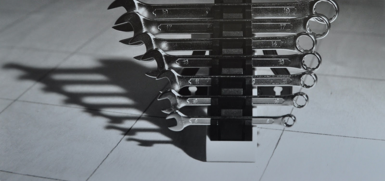
On Friday we had a black & white printing workshop with Colin; I'd already done 35mm developing but was really excited to learn about how to use grades to change the tones in the image. When I developed a contact sheet all of my images were relatively well lit and toned; we were then asked to choose one to develop.

I began by making a test strip going up in 5 second intervals and decided to develop my first strip for 13 seconds, however I wanted to draw out more of the tone in the highlights as the reflection in the spanners was very bright. Therefore I decided to change the lens setting from F/8 to F/11 to let less light through which meant I would double the exposure time to divide it between different grades. For my third test I exposed the paper at Grade 0 for 10 seconds and at Grade 2 for 16 seconds.


To add even more tone I increased the exposure at Grade 0 to 20 seconds and decreased Grade 2 to only 6 seconds.

To then enhance the black tones back to the original strip I added an exposure of Grade 5 for 5 seconds which gave a bold contrast between the shadows in the background and highlights on the spanners yet created a softer tonal range throughout.

I then chose a second image to print, again I did a test strip in which I chose an exposure time of 13 seconds.


After doing a whole strip of 13 seconds I wanted to see whether I could
draw out more tones therefore I did a whole strip of 13 seconds at grade
0. This made the highlights much softer creating a more tonal image; I then added on top of this 5 seconds at grade 5 which brought back the shadows.

I finally decided to experiment with burning the bottom right corner as it was very bright and did not give much tone; I did this by added a further 5 seconds at grade 0 where I covered most of the image with my hands leaving the corner exposed, moving my hands constantly so that there was no obvious change in exposure.

In the workshop today, I was taught how to create an even frame around the image as well as positioning the image at the top of the paper to give weight to the bottom of the photograph so it hangs better. I also learnt how to use the different grades, grade 0 to add more tone throughout the lights and darks and grade 5 to draw out the blackest backs and lightest lights to reduce the tone, and finally I learnt how to successful burn areas of an image.
No comments:
Post a Comment